Work

Browse by Discipline

Digital Products and Services

Quickmap Modernization

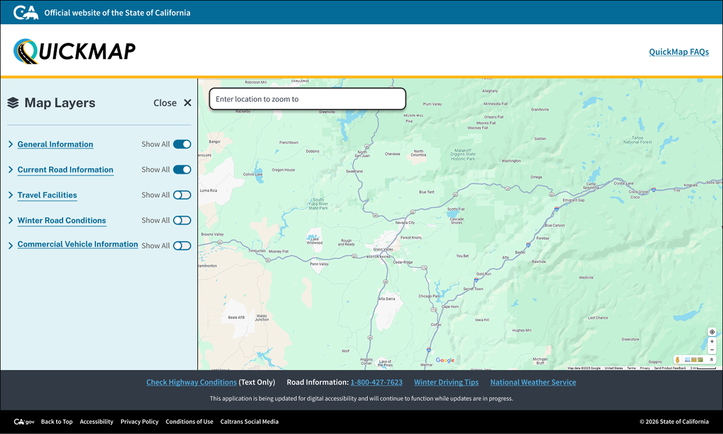
Led the frontend redesign of California’s public traffic and road conditions tool, modernizing an outdated visual system across web and mobile. Designed a full rebrand—new logo and an icon system organized by map layer category, built on the Caltrans palette and vetted for contrast and legibility. Aligned every flow with state design standards and accessible interaction patterns.

Explore OEIS Power BI Case Study
Construction Contracting Opportunities Portal

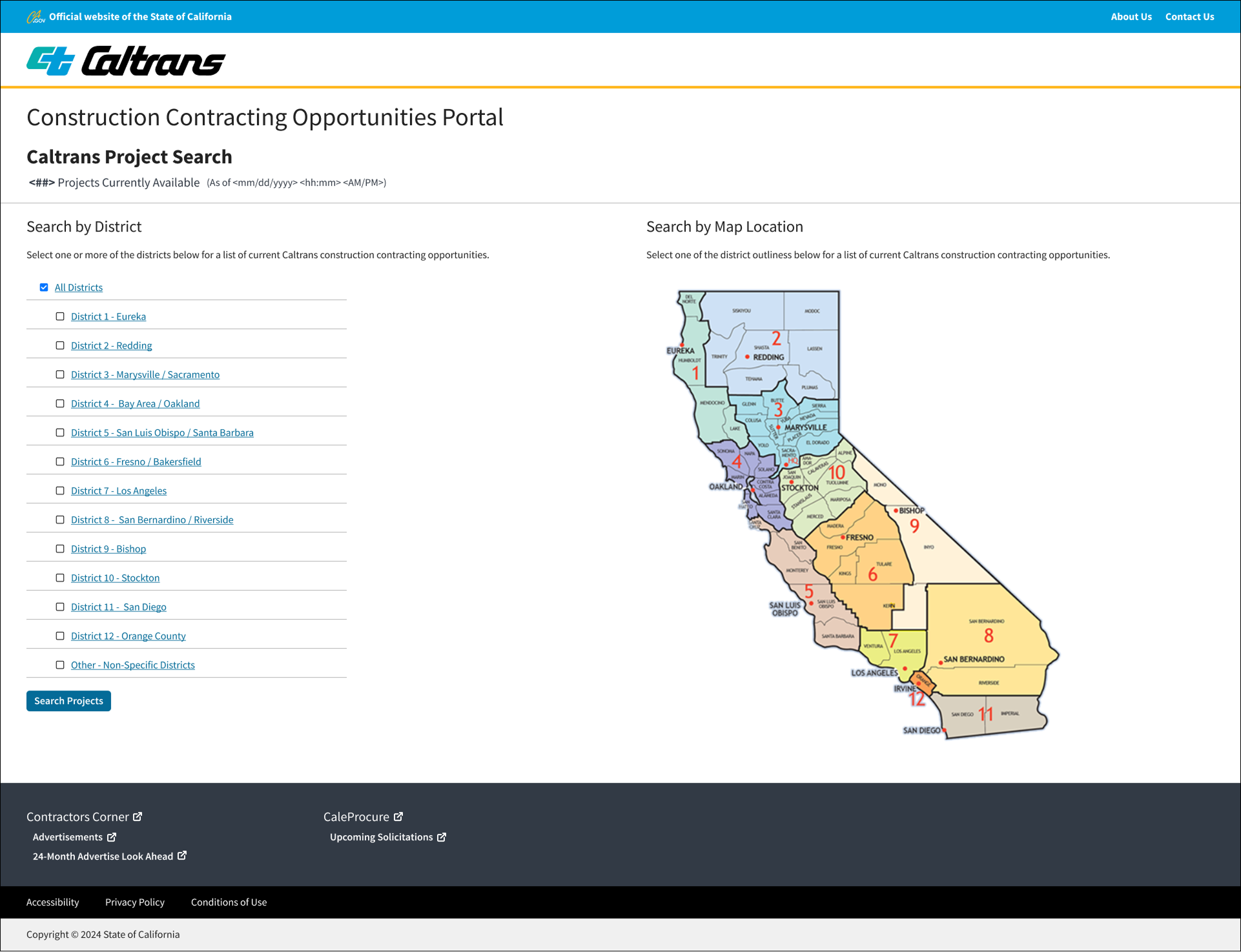
A self-service portal for contractors to find construction opportunities across California’s 12 districts. Built two parallel search paths—checklist-based district search and an interactive statewide map—so contractors could search the way they already think, by district name or by geography. Added a sortable table view with license, dates, and county for fast scanning.

Explore CCOP Case Study

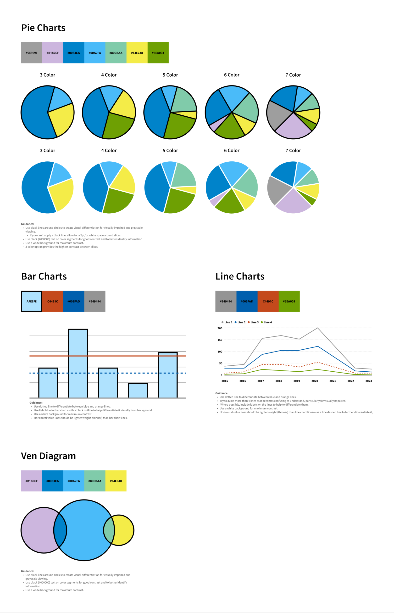
Utility Compliance Data Portal

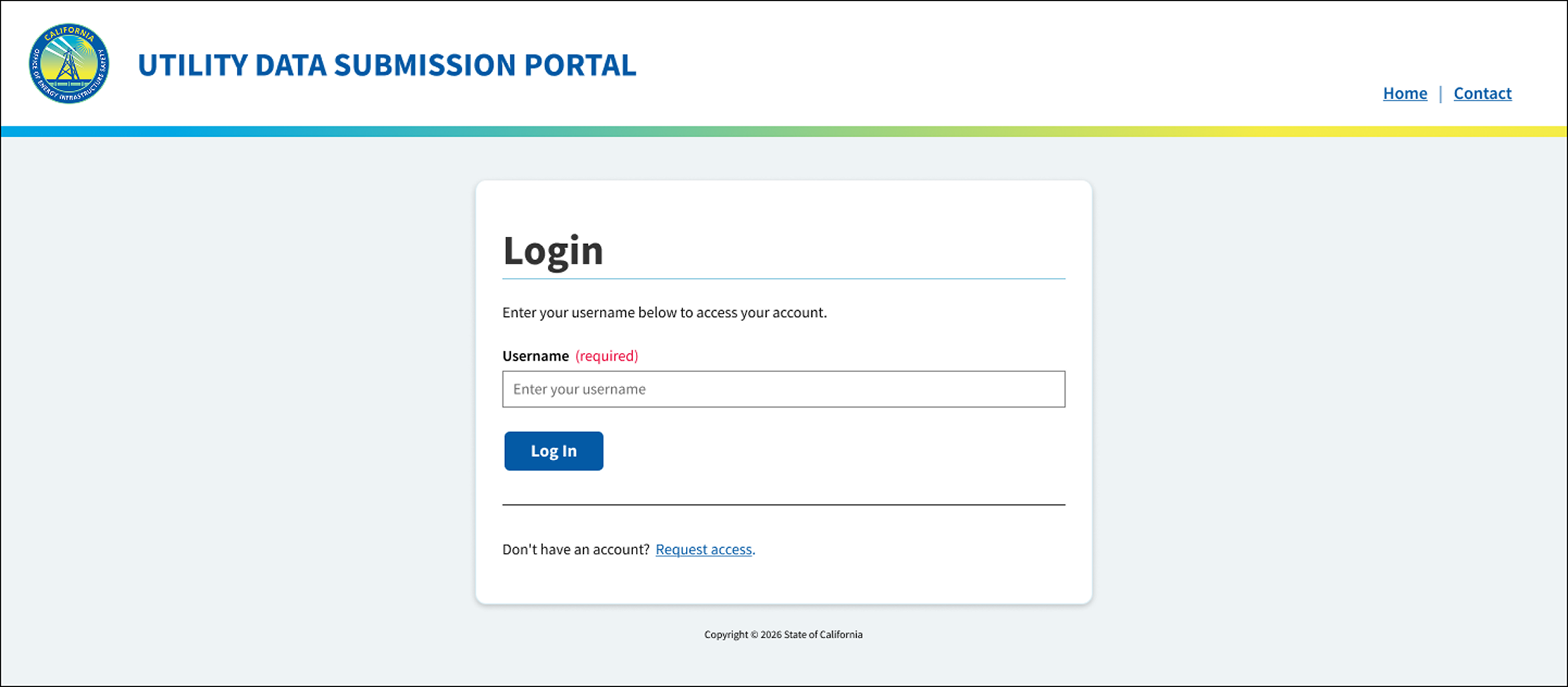
A self-service portal for utility companies to submit compliance data, replacing a manual email process with no submission tracking. Defined user types, mapped journeys, and built the information architecture before wireframing and a design system aligned to the client’s brand. Every flow gives clear status visibility to both utility submitters and program administrators.

Explore UDSP Case Study

Publications and Reports

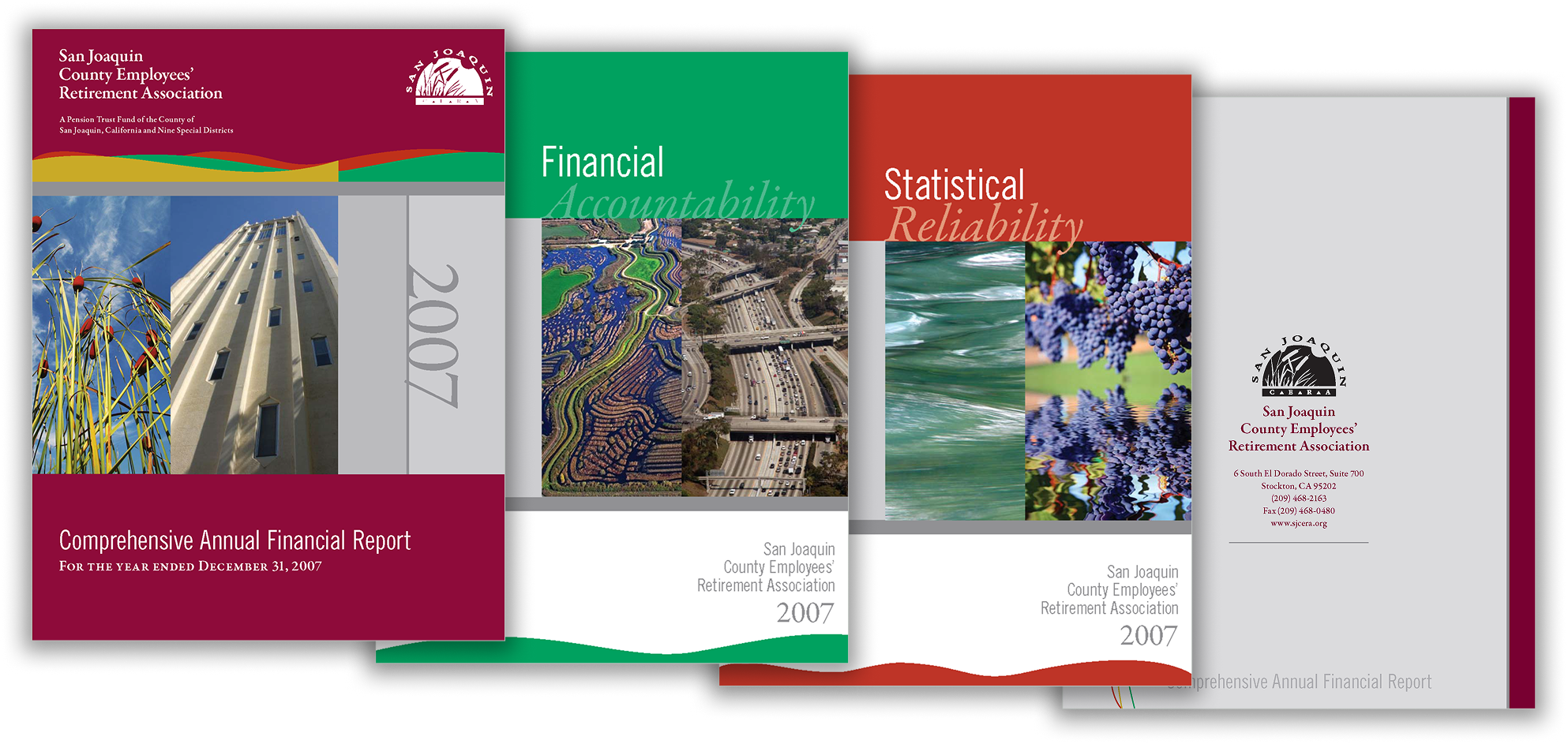
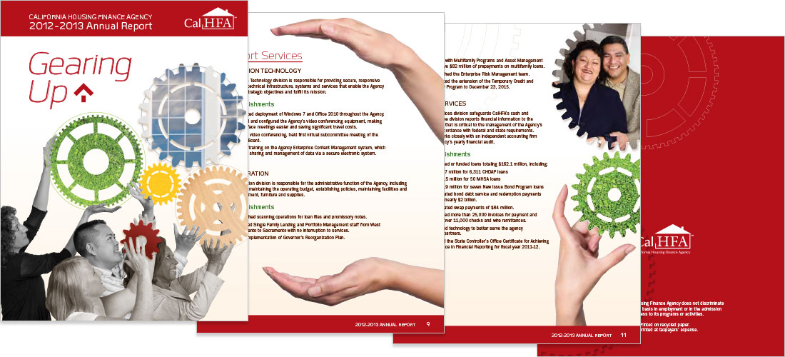
Multi-year Annual Report Design

Six consecutive years of CalHFA’s annual report, with a fresh visual concept each year tied to agency mission and milestones, including a full rebrand for the 40th anniversary. Print and digital reports, financial statement covers, CD labels, and companion microsites, all holding brand consistency across formats.

Explore CalHFA Annual Report Case Study

Book Design and Layout

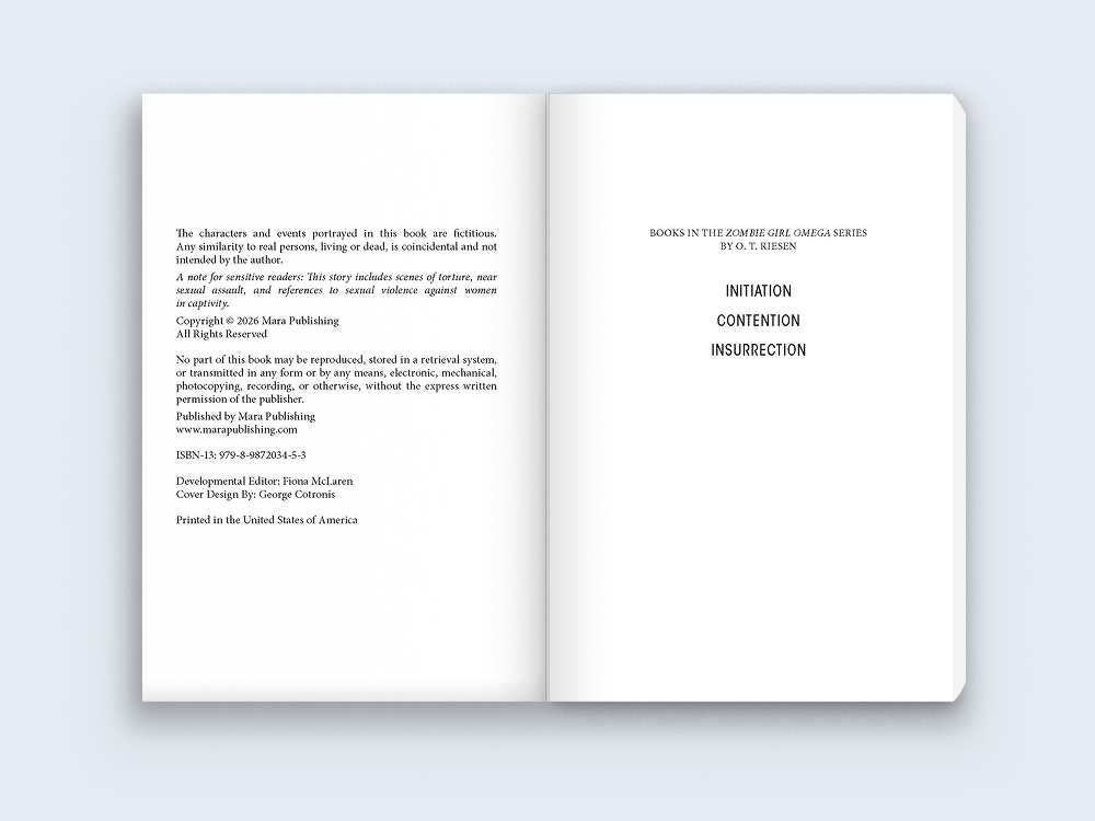
Book Interior Layout, Children of Eden

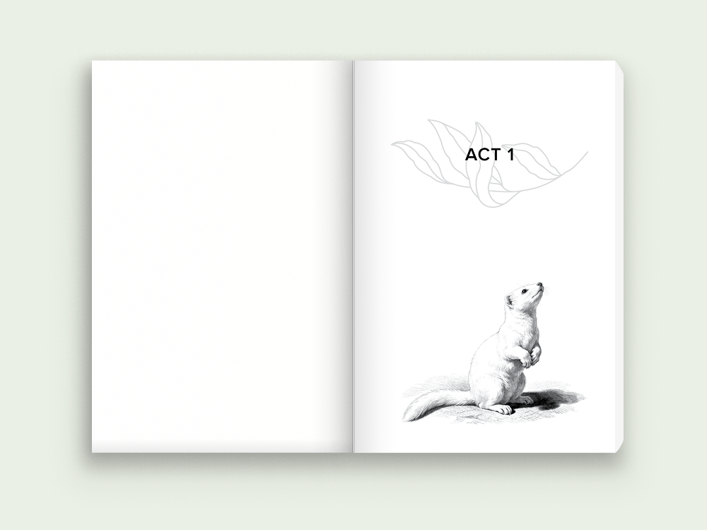
Interior layout and custom title logotype for a literary post-apocalyptic novel—a deliberate shift in typographic voice from genre military sci-fi to a quieter register. A botanical motif carries through epigraph, act dividers, and chapter openers, balanced against clean body typography for long-form reading.

Explore COE Book Design Case Study

Digital Products and Services

Quickmap Modernization

Led the frontend redesign of California’s public traffic and road conditions tool, modernizing an outdated visual system across web and mobile. Designed a full rebrand—new logo and an icon system organized by map layer category, built on the Caltrans palette and vetted for contrast and legibility. Aligned every flow with state design standards and accessible interaction patterns.

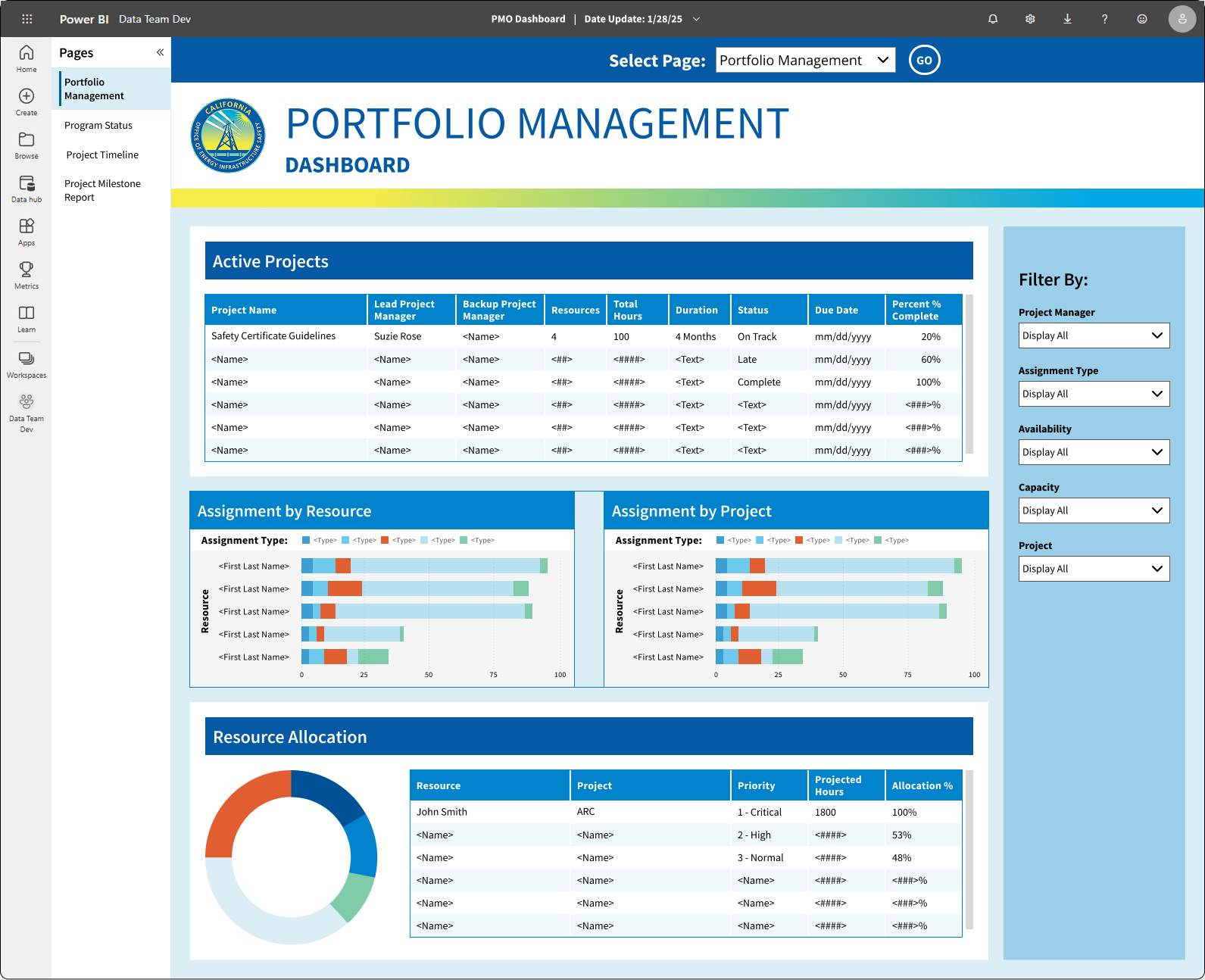
Explore OEIS Power BI Case Study
Construction Contracting Opportunities Portal

A self-service portal for contractors to find construction opportunities across California’s 12 districts. Built two parallel search paths—checklist-based district search and an interactive statewide map—so contractors could search the way they already think, by district name or by geography. Added a sortable table view with license, dates, and county for fast scanning.

Explore CCOP Case Study

Utility Compliance Data Portal

A self-service portal for utility companies to submit compliance data, replacing a manual email process with no submission tracking. Defined user types, mapped journeys, and built the information architecture before wireframing and a design system aligned to the client’s brand. Every flow gives clear status visibility to both utility submitters and program administrators.

Explore UDSP Case Study

Publications and Reports

Multi-year Annual Report Design

Six consecutive years of CalHFA’s annual report, with a fresh visual concept each year tied to agency mission and milestones, including a full rebrand for the 40th anniversary. Print and digital reports, financial statement covers, CD labels, and companion microsites, all holding brand consistency across formats.

Explore CalHFA Annual Report Case Study

Book Design and Layout

Book Interior Layout, Children of Eden

Interior layout and custom title logotype for a literary post-apocalyptic novel—a deliberate shift in typographic voice from genre military sci-fi to a quieter register. A botanical motif carries through epigraph, act dividers, and chapter openers, balanced against clean body typography for long-form reading.

Explore COE Book Design Case Study