Core Competencies:
- Art Direction
- Book Layout
- Graphic Design
- Image Research & Licensing
- Logotype Design
- Print Layout
- Typography

Children of Eden is a literary post-apocalyptic novel from an author previously working in military science fiction. Readers arriving from that earlier work would expect the same typographic voice, but the book needed a quieter, more literary one.
The book also carries a symbolic-biology theme that runs underneath the narrative, which an interior can either reinforce or ignore entirely.
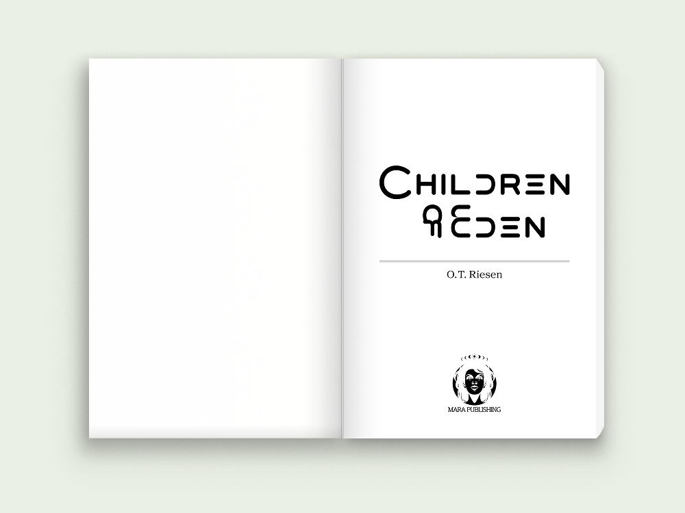
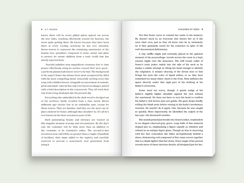
I designed the interior layout and drew a custom title logotype, setting a literary tone from the title page forward and distinguishing the book from the author’s genre work.
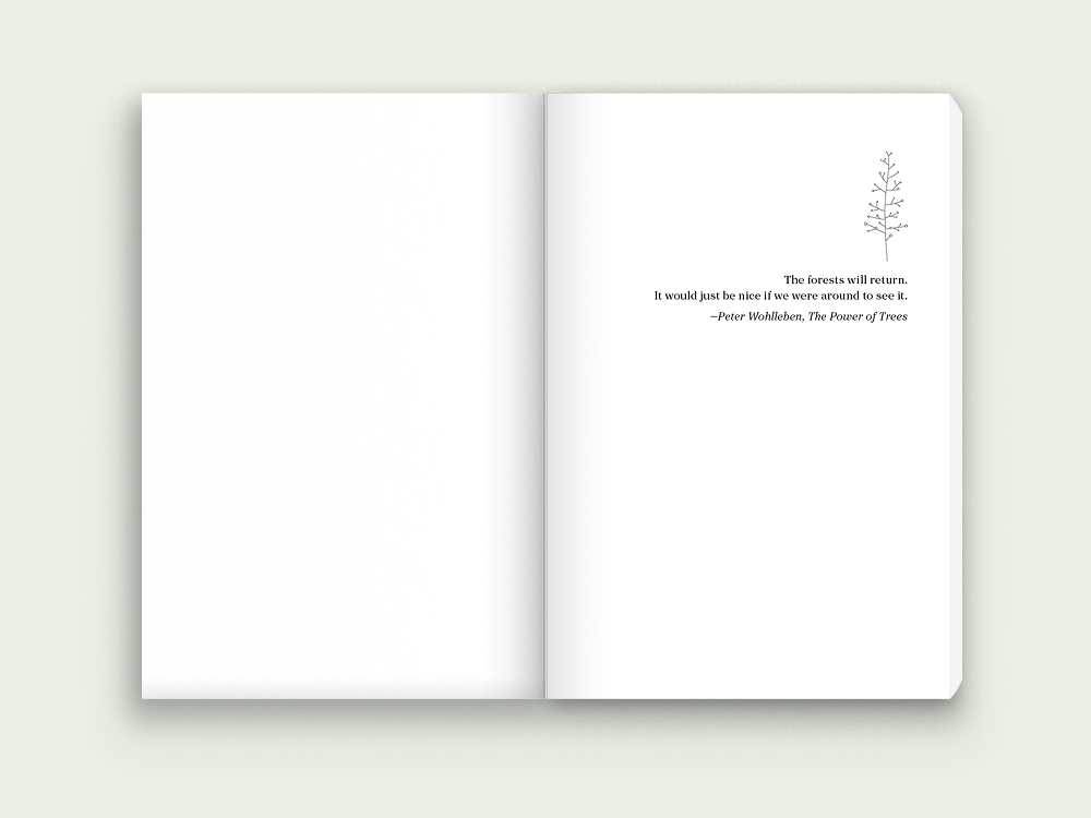
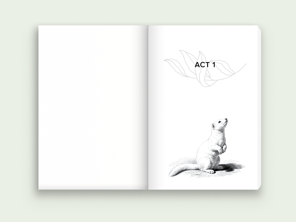
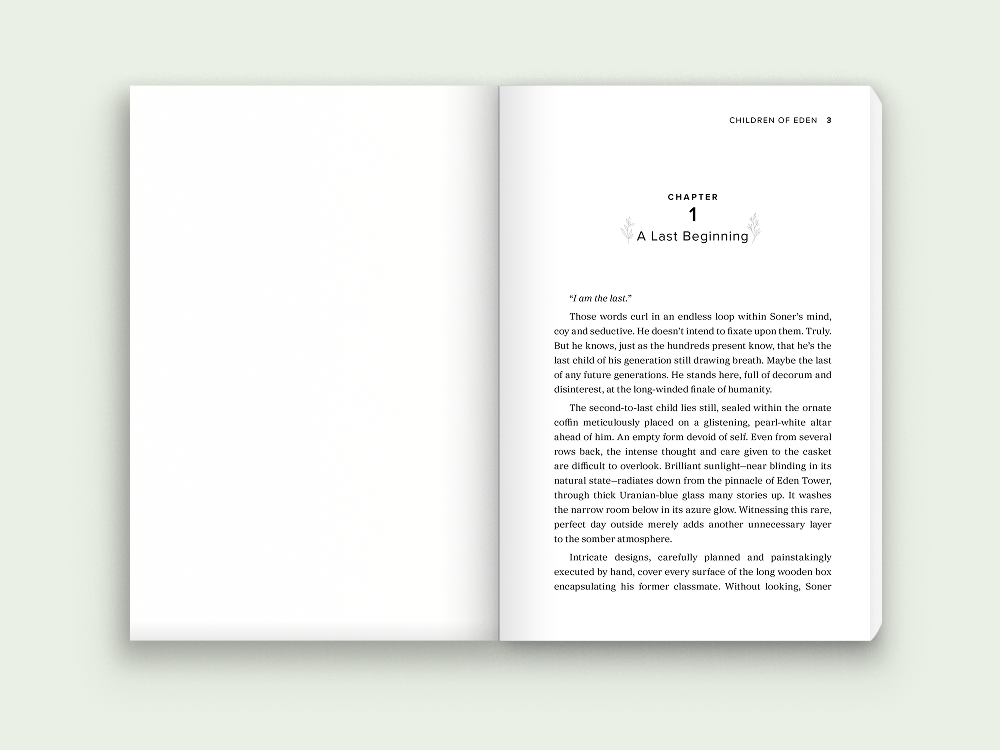
Rather than decorate individual pages, I researched and licensed a botanical illustration set and built it into a single motif, carried through the epigraph, the act dividers, and the chapter openers. The pieces had to share a drawing style and weight, sit correctly against the type, and read as one deliberate system rather than as stock art placed page by page. The theme accumulates as a reader moves through the book instead of appearing once and disappearing.
The illustrated elements are balanced against clean, unadorned body typography set for long-form reading, where success means the reader never notices it. The result is an interior that signals literary fiction while remaining comfortable across four hundred pages.