Core Competencies:
- Accessibility
- Branding
- Data Visualization
- Design Standards Documentation
- Design Systems
- Information Design
- Visual Design

Power BI makes it easy to build a chart and hard to build an accessible one. Default palettes distinguish series by color alone and fail in grayscale or for a reader with color vision deficiency. Multiple people produced reports at OEIS with no shared standard, so charts varied across dashboards, and many excluded parts of their audience.
The agency needed rules its own staff could apply, specific enough that the next chart someone builds is accessible and on-brand without a designer in the room.
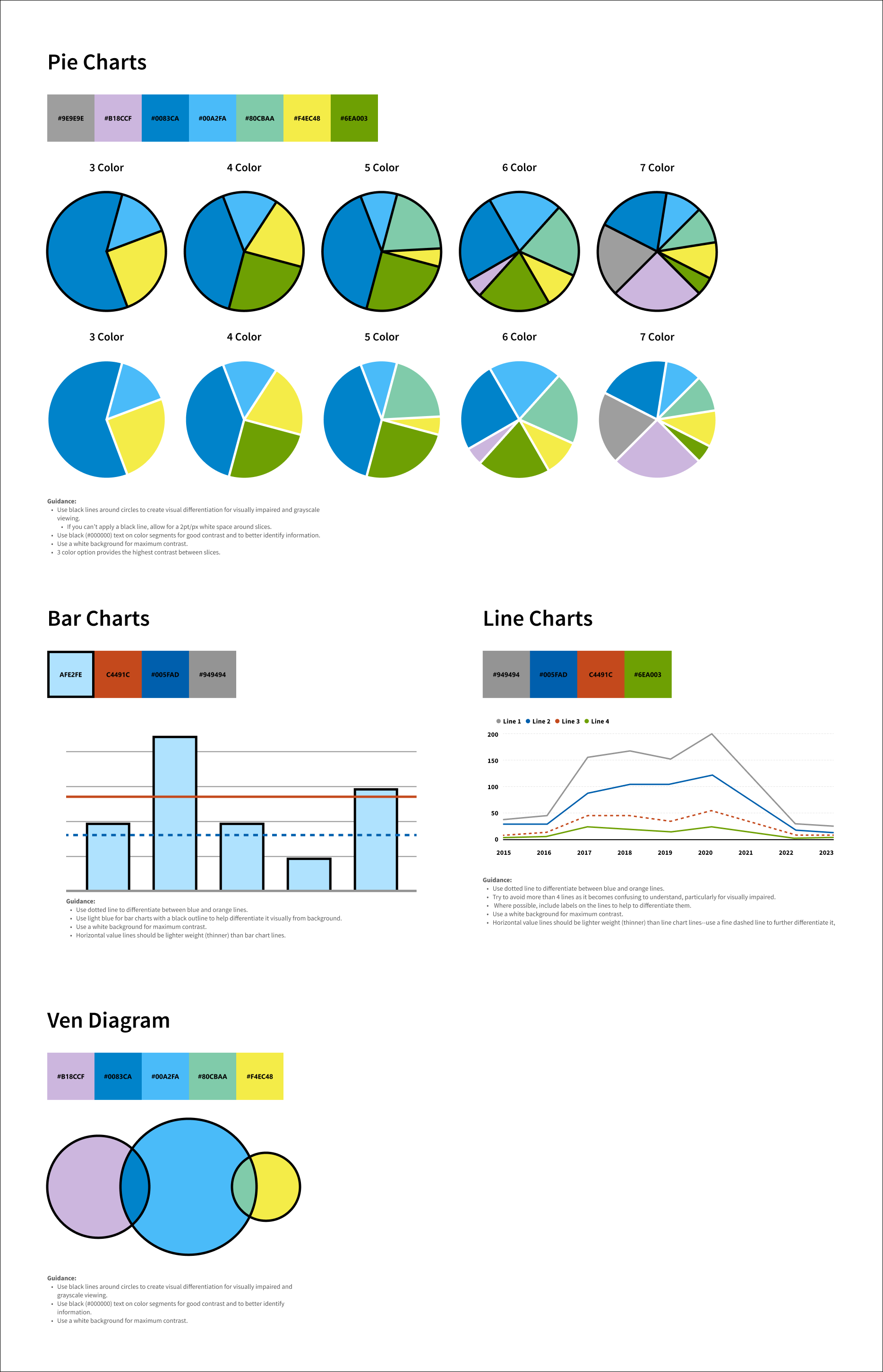
I built a documented chart and color standard covering the four formats OEIS uses: pie, bar, line, and Venn. Each specifies its palette in hex, shows it applied at every viable series count, and carries written guidance explaining the reasoning behind the rule.
Palettes are drawn from the agency’s brand and tested for contrast and grayscale legibility. Throughout, color never carries meaning alone. Segments are separated by black outlines, or a 2-point white gutter where an outline isn’t possible, so adjacent slices stay distinguishable in grayscale. Line charts pair color with pattern and cap at four series, beyond which the chart stops being readable. Value gridlines are specified lighter than data lines, so the data always reads in front of the scale.
Written for frontend Power BI users rather than for designers, the standard has been adopted across the agency as the guide for building future dashboards.