
Resurrection of the Hero
Hero Image, that is.
When I first began to do web site design (and this is probably dating me), the trend was towards a large splash page reminiscent of a magazine’s cover page. The majority of the landing page’s prime real estate was this wonderful graphic, leaving little room for anything else.
This design concept went down in flames, courtesy of the UX/UI community for many reasons–the majority of which were good and true. Too long of load time (remember those lovely “skip” links?), users don’t scroll down “below the fold” and miss important information, navigation confusion, lack of accessibility, etc. I think there was also a general contempt by non-visual designers that so much real estate was being used by a single image and graphics on a web site were akin to ruffles on a dress. Pretty fluff with no real value.
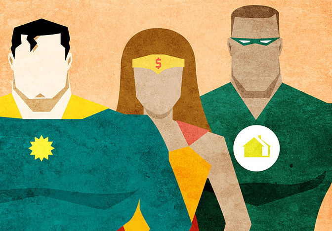
Here we are however many years later with the resurgence of what’s called the “Hero Image.” This is one large, all-encompassing graphic that is plopped front and center on a home page. Eye candy designed to do what visual design does and should do well. Persuade. Create visual interest. Hell, make a person want to go further into your site and get to know your product.
Long gone are issues of load time and customers not understanding that they can scroll and find there is more to a page then the tiny sample you see on the top. Yes, there are still a percentage of the users out there who have this issue, but I’d wager they’re in your 20% or less folks. The option of a slide deck or carousel with accessible content means there’s no stopping the hero image. It’s also quite functional when using a responsively (responsibly) designed web site.
Add to that the fact that around 65% of the general public are visual learners (and I’d argue the percentage of web users is even higher). Then there’s the whole side of human biology in that 90% of information transmitted to the brain is visual, and visuals are processed 60,000 times faster in the brain than text. (Sources: 3M Corporation and Zabisco). Still not convinced? There’s a great article by Kari Pritchard regarding images and the web that I recommend checking out for a quick read.
This doesn’t mean get all crazy and design every page as a splash page, but do use your home page as it is intended: to reach out to your users. Hero image, you’re my hero.